
Contrasting colors in food photography are one of the easiest ways to instantly elevate your restaurant photo shoot. As a professional restaurant photographer, I know how much of an impact thoughtful styling can have. Using color contrast is one of my go-to restaurant photography styling tips for creating vibrant, eye-catching images. In this post from my Restaurant Photography Must-Haves series, I’m breaking down why color variety creates stronger food photography images — and how to use color effectively.
When you plan a menu photo shoot, it’s natural to think about your signature dishes first. But what often gets overlooked is how the colors of your dishes work together visually. Most menus have plenty of dishes within the same color family — think tacos all wrapped in yellow corn tortillas or a lineup of red-sauced pastas. This can make your photo gallery look a little too uniform and a little boring.
By intentionally adding visual contrast, you create a gallery of images that creates hunger and evokes cravings and at first glance. Rich, dark mole sauces, bright green pestos, vibrant purple pickled onions, fresh herb garnishes, or even a colored cocktail can add that much-needed pop of color to your overall collection of images. These contrasting elements help draw the viewer’s eye and create visual variety without straying from your brand or cuisine style.
Why Contrasting Colors Matter in Restaurant Photography
- Create Visual Interest: When all the dishes on your menu are similar in color, they can blend together, making it hard for each item to stand out. Adding a splash of contrasting color helps each dish shine on its own.
- Enhance Appetite Appeal: Colors can influence appetite and perception. Red and yellow stimulate hunger, while green and purple convey freshness. Using contrasting colors enhances the viewer’s emotional connection to the food.
- Make Your Menu Pop: Contrasting colors can turn a standard photo into an eye-catching visual that makes your menu pop. It can be the difference between a scroll-past photo and one that gets double-tapped on social media.
- Balance Your Color Palette: Restaurants often lean too heavily on one color scheme. Introducing contrasts, such as bright garnishes or sauces, can balance a dish’s visual appeal, making it more dynamic and inviting.
How to Use Contrasting Colors in Your Restaurant Photography
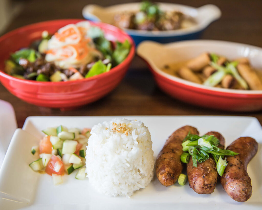
✔ Pair Neutral and Vibrant: If you have a lot of dishes that are brown, beige, or a single neutral color, offset those with vibrant, contrasting ingredients. Some grated cheddar cheese adds some brightness while keeping chili in the warm tones, while fresh green onion or cilantro adds a contrasting color which adds some vibrance to the image. Both are great ways to brighten up a dull palette.
✔ Mix Warm and Cool Tones: Combining warm colors (like reds, oranges, and yellows) with cool tones (like greens, blues, and purples) creates balance and makes the food appear more dynamic. For instance, pairing a red tomato-based sauce with a leafy green garnish can make both colors pop.
✔ Consider Your Plate or Backdrop: Sometimes it’s not just the food that needs to contrast — think about your plates or backgrounds, too. A light-colored dish on a dark table or a dark plate against a light-colored sauce can create instant contrast.
✔ Add Contrast with Strategic Saucing: Adding a rich, dark mole sauce to a light-colored protein or pasta creates a striking visual that draws the eye. Keep in mind, sometimes a sauce doesn’t need to cover the whole plate — a swoosh, a few pearl-sized drops, or a light drizzle can be just enough to add that extra pop of pizzazz without overwhelming the dish. Keep in mind, a subtle touch of sauce can feel more intentional and refined, elevating the overall presentation and making the dish look polished and professional.
✔ Emphasize Freshness with Garnishes: Fresh herbs like basil, mint, or cilantro can add a burst of green that contrasts nicely with more neutral or rich-colored dishes like pasta, meats, or potatoes. Seasonal items like fresh fruit in the summer and winter vegetables like beets and butternut squash provide colorful options which add natural vibrancy while making images more enticing by reinforcing the idea of freshness and quality.
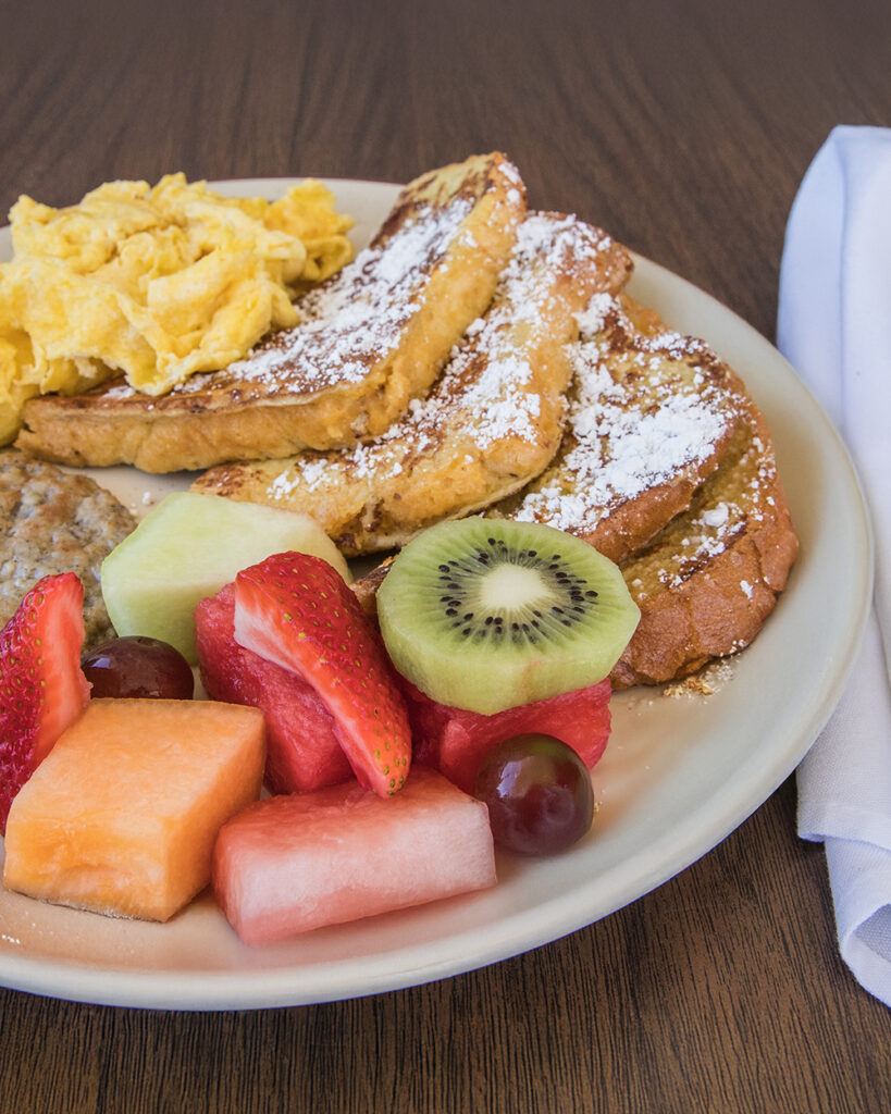
✔ A Trusty Sidekick: Some chefs won’t want their dish modified with a garnish or contrasting sauce. That is when you can place a vibrant side in the photo to add a pop of color next to the main dish. Take, for example, the tan colored french toast served with brown sausage and yellow scrambled eggs at a diner — pretty monochromatic, and even more monochromatic when the tables are brown and the plate is tan. That is when you make sure the fruit it is served with adds some color with a fresh strawberry.
Restaurant Food Photography Tip: The Magic of Complementary Colors
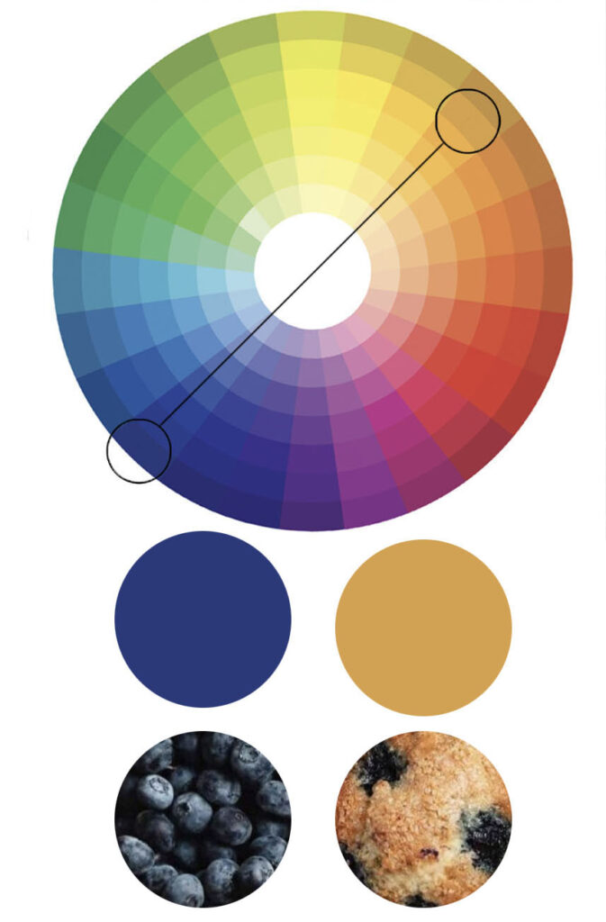
Complementary colors are pairs of colors that sit opposite each other on the color wheel — like red and green. When placed next to each other, they create the strongest contrast and make each color appear more vibrant. This principle is a secret weapon in food photography, helping dishes look fresher, more dynamic, and naturally more eye-catching.
Look at the color wheel I have here. It demonstrates how the color of blueberries is straight across from the golden cake of the vanilla muffin it lives in. Perhaps it is not just the taste that creates the appeal of a blueberry muffin — because we eat with our eyes first.
It’s why strawberries look so striking on a bed of dark green kale, or why a bright sprinkle of basil makes a bowl of red marinara sauce feel even more mouthwatering. When you intentionally pair complementary colors on a plate, the image comes alive without needing extra editing tricks. It’s a simple, natural way to boost the visual appeal of any dish — especially when photographing restaurant menus where you want immediate, irresistible impact.
Contrasting Colors: The Secret Ingredient for Standout Food Photography
In the end, great restaurant photography isn’t just about showing the food — it’s about creating an experience through color, texture, and variety. Thoughtful use of contrasting colors is an easy, powerful way to do just that.
Want your food photos to pop? I use contrasting colors in my restaurant photography styling to highlight the food and draw the viewer in. By ensuring your food photography incorporates a variety of colors, you’ll make your menu visually captivating and more likely to attract and engage customers — both in-person and on social media.
Final Takeaway: Use Color When Styling Restaurant Photography
Want photos that stop the scroll and get mouths watering? Let’s talk about how we can bring your restaurant’s story to life through vibrant, appetite-inducing imagery.
Up next in this series on Must-Have Shots for Restaurant Photography: USING A MIX OF SHAPES. Having variety of item shape from plates and bowls to slices and pieces can add interest and attract attention to Restaurant Photography. Don’t get me wrong, I love a stack of matching plates. But for an overhead shot, all of the dishes should not be the same shape if you want to add interest. Bonus points for mixing shapes on the shape like a triangular slice of cake on a round plate, and a round burger on a rectangular plate. If all your plates and bowls are round, be sure some of your food includes other shapes. I’ll also share other ways to introduce other shapes to the scene.
In case you’re new to this series, you can jump back to Part One: Must-Have Shots for Restaurant Photography here.


leave a comment